

FORMSON's office breaks away from the conventions of bland workplace interiors. Designed by SPACELAB, it takes a more expressive approach. The office was photographed by MOIZ.
Kitchen utensils become part of the interior
FORMSON's headquarters makes the company's priorities clear: creativity, a positive outlook and flexibility. As well as providing a practical setting for exchanging ideas, the interior offers an interesting way to show what the business does. Two unusual wall installations made from silicone spatulas are among its most surprising features.

The idea emerged during a visit to FORMSON's factory, which specialises in kitchen accessories. The office is likened to a living organism, both because of the people who work there and because it gradually reveals itself as visitors move through it. The route builds anticipation at each stage, from the entrance through the refreshment area to the conference room.
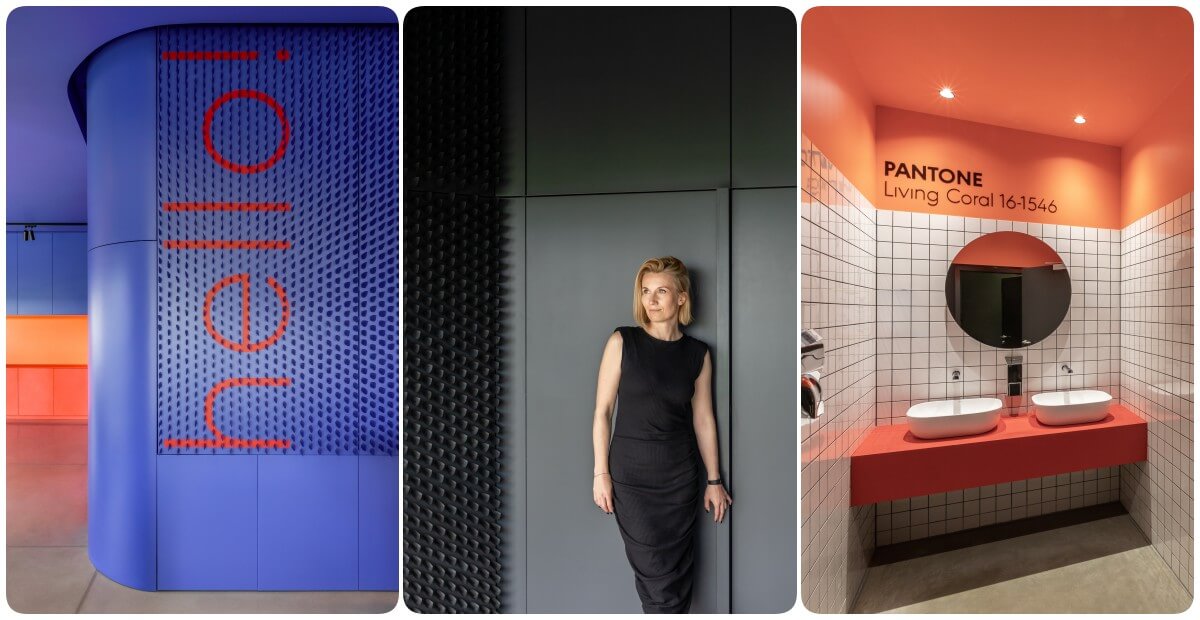
Individual rooms reflect the different Pantone colours and tones used by the brand. The corridor is the exception, with a deliberately monochrome scheme that plays with visitors' expectations. Branding is visible almost immediately, but takes the form of an unusual visual expression of the company rather than intrusive advertising. A wall covered in rubber spatulas acts as a large-scale moodboard. Visitors can touch every element, engaging their senses and gaining a better understanding of the quality and character of the company's products.
Colour beyond the monochrome corridor
Behind the minimalist doors is a different world of bold patterns and Pantone colours. The coffee corner, used by every employee, is small but highly practical. It evokes comfort and the smell of good coffee. A round table and chairs, blue units and lighting with an industrial feel sit against a black-and-white backdrop.

Opposite is a storage area in an energetic shade of orange. The conference room initially appears restrained but contains an unexpected detail of its own. One wall is made from trivets for hot dishes.
The shared workspace contains comfortable desks, a red table, unusual lighting and an installation of blue spatulas bearing the word “HELLO”. Plants occupy suspended modules rather than conventional pots. These hang above the workstations, introducing a natural element to the office in an innovative way.
Pantone colours in the washrooms
The final stop is the washroom area, although that prosaic description hardly conveys its character. Energetic Pantone colours distinguish the two rooms: Living Coral in the women's WC and 2117 C in the men's. Playful forms appear in every detail, with rounded edges giving the space a sense of flow and mirrors adding depth. Square tiles contrast with the soft lines of the walls to create an unusual visual effect.

Products used in the project
- Kitchen spatulas used in wall installations: FORMSON
- Trivets used as wall cladding: FORMSON
An office interior can make room for both everyday work and a company's identity. Explore more projects by Agnieszka Deptuła of SPACELAB on her PLNDesign profile and get in touch by email, phone, website or social media, whichever suits you best.
See also:
- The Design Group gives Yareal Polska’s Warsaw office a domestic feel
- After 18 years at home, a designer opens her own studio in Pabianice, Poland