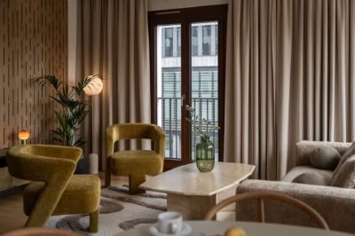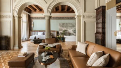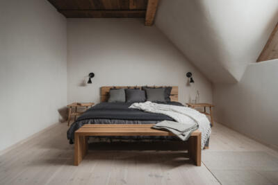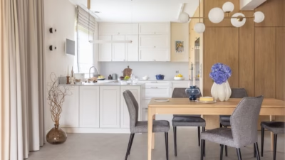


A compact space has been transformed into an appealing 40-square-metre flat in Warsaw. Despite a carefully managed budget, it contains high-quality materials and notable pieces of design. Piotr Łucyan, owner of Art’Up Interiors, balanced use, form and cost to bring out the interior’s potential. The flat was photographed by Ład Studio.
A change of plans for a compact flat
The buyer of this 40-square-metre flat in one of Warsaw’s residential districts gave the designer a free hand. His trust came from their many previous collaborations, first on his own house and later on a series of investment properties. This small flat was also intended for the premium rental market, until the owner’s son decided to move in. The young man helped raise the specification above the original plans, while keeping spending under control.

Art’Up Interiors usually works on larger homes, but here the team created a comfortable first home for a single person or a couple. A well-organised utility area keeps the remaining rooms visually uncluttered. It also helps maintain the minimalist appearance of the bathroom and kitchen.
“Despite the limitations, including the proportions of the rooms, we managed to create a living area with an open-plan kitchen, a separate bedroom, a bathroom and a separate dressing room with laundry facilities. That last room is particularly valuable here,” stresses Łucyan.
American walnut as the premium option
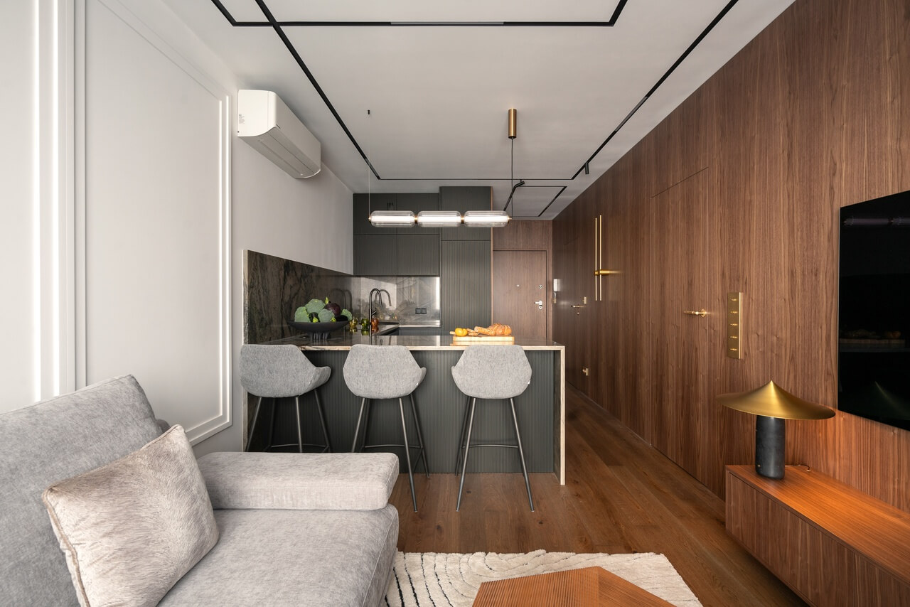
To achieve the quality the clients wanted, Łucyan proposed American walnut cladding for the living area, a timber that has become almost a signature of his work. Contemporary panelling covers the walls from the entrance to the television. Doors to the other rooms blend into it, giving the sitting room a quiet, cosy character. Gold-coloured accents from minimal wall lights and brass switches by Polish company Vectis stand out against the dark background.

“Walnut was the premium option,” says Łucyan with a smile. “Following the brief, we also developed a more economical version based on wallpaper. The highest quality won, particularly as natural wood lasts for decades and is therefore very economical in the longer term.”
Adjusting the room’s proportions
The dominant dark finish might seem a risk in a small flat, but it works well here. Seen from the entrance, the panelling continues elements of the communal stairwell, making the space appear larger. Once the front door is closed, it changes how the long room is perceived. “Because it contrasts with the pale sitting area by the window, it makes the overly elongated room seem shorter,” Łucyan explains. Graphic divisions across the ceiling, formed by decorative lighting tracks, and on the walls have a similar effect. The contemporary mouldings create an unusual illusion of recessed panels.

Restraint in the remaining furnishings is equally important to the overall composition. Two tables, one stone and one timber, are among the pieces that stand out. Wall lights by Aromas Del Campo, with shades resembling conical hats, offer a good balance of quality and cost. A stone-and-metal table lamp on the television cabinet echoes their forms.
Natural materials in the kitchen
A striking glass-and-brass chandelier by the same brand hangs above the island, subtly separating the kitchen from the sitting room. The main division, however, comes from the contrasting colours, while several details connect the two spaces. “The rhythmic grooves in the kitchen fronts are echoed in the ribbed radiators and coffee table, while the free-form pattern of the sitting-room rug has a close affinity with the markings of the grey-beige quartzite,” says Łucyan.

The stone’s painterly veining appears across the worktops and walls, lending a high-quality finish to the small but fully equipped kitchen. It is also a substantial decorative feature, and its polished surface reflects light into the room. Black appears within the veining and is repeated on the cabinet fronts. There are no glazed cabinets, so visible crockery does not add further shapes, colours or textures.
A pared-back bathroom
The bathroom’s elegant simplicity suggests modernist, loft and Japanese interiors. “In the terrazzo slabs underfoot, you can find a distant echo of Zen rock gardens,” suggests the designer. Free of excess objects, the refined space offers a setting for both physical and mental renewal.

To achieve the minimalist effect, Łucyan used large-format Italian sintered stone with a pattern suggesting both rock and clouds. Black elements, particularly the furniture and shower enclosure, form graphic lines against it. Bathing products are easy to reach but largely out of sight on recessed shelves. Other bathroom accessories and spare towels are hidden in a capacious yet discreet built-in cupboard. Matt fittings in an unusual bronze tone add a subtle glint.
A bedroom behind the walnut wall
One of the doors concealed in the sitting room’s walnut wall leads to the bedroom beside the bathroom. As the most private room in the flat, it remains out of view, but Łucyan describes a pale palette with a black wardrobe that echoes the kitchen units. An Artemide light is its decorative feature, resembling a lantern of delicate fabric stretched over metal rings.
Products used in the project
- Brass light switches – Vectis
- Wall lights and glass-and-brass chandelier – Aromas Del Campo
- Bedroom light – Artemide
Careful storage and well-chosen materials can make a compact home comfortable to live in. Explore more projects by Piotr Łucyan of Art’Up Interiors on his PLNDesign profile and get in touch by email, phone, website or social media, whichever suits you best.
See also:
- A 30-square-metre Wrocław flat for short stays and longer lets
- A young graphic designer’s Poznań flat takes its colours from the flooring